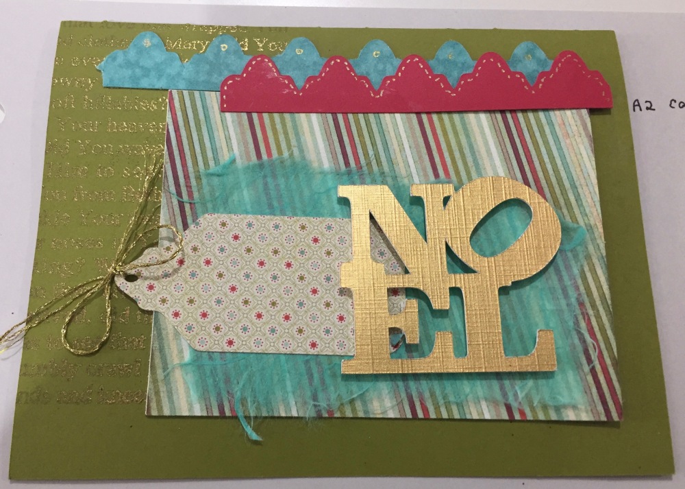
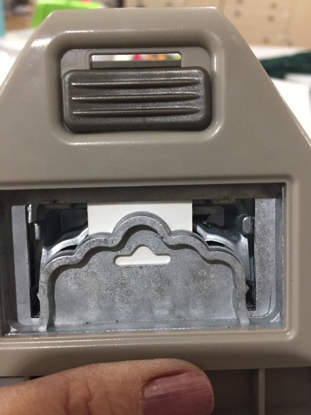
 This is round 2 of the cards I have made using sketches from the Silhouette Store. I am really getting to like these sketches. They are kind of like having a rubber stamp that can be made into any size. And they don’t take up space in my stamp drawer! I am still using the Amy Chomas pen holders (see this post: https://ifthegluesticks.com/2012/07/25/silhouette-ske…as-pen-holders/) and love them. I will say one thing however, while I ordered both the small holder and the large holder it is the large one that I use all the time. I can’t seem to find pens small enough to fit in the small holder. Something to think about.
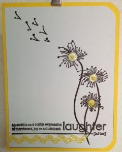
This could have made up as a one layer card by stamping a border under the definition and using a bit of yellow stickles on the dandelions.
Dandelion Sketch #32314; Laughter Definition: Stampabilities Definitions
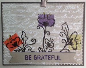 Okay, this card has it all. Sketched flowers, rubber stamping, distress ink, die cut banner, dimensional adhesive, and letterpress using an embossing folder. Gasp. I started out by sketching the floral motif and then used a Hero Arts shadow stamp to highlight the blossoms. It still looked like it needed something so I brayered the concave side of an embossing folder with distress ink and ran the panel through my Cuttlebug. Since I cut out my banner in white cardstock I was able to use the same ink for it that I had used for the background. When I placed the banner on the card I found that the background was showing through the word cutouts so I traced the banner on another piece of cardstock and inked it with the purple ink. That looked much better! I glued the bottom (purple) banner directly to the card and then used dimensionals to add the top banner. Lots of fun.
Flower Motifs: #43709; Banner Words-Life: #37895; Hero Arts Scalloped Solid; Paper Studio: Horizontal Script; Distress Inks; Pumice Stone, Ripe Persimmon, Dusty Concord, Shabby shutters.
 I sketched these little guys and then stamped the dots on the blossoms. I like the wonky kind of look I get with this technique. Remember what I said about being able to make these any size? The original file for each flower was a little over eight inches. I scaled them down to an inch and a half.
Flower Sketches: #30091, 30092, 30093, 30094
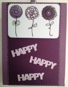
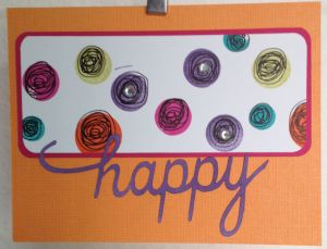 These cheery dots just screamed “use the word ‘happy'” , so I did. Sketched dots, distress ink and rhinestones made a very fun panel. The nice thing about having the word happy on the outside of the card is that the inside can say “birthday’, “day”, etc. Very handy, especially for me as I never seem to have the right sentiment at the right time.
Polka Dot Sketch: #19374; Sentiment: 38773; Distress Inks: Picked Raspberry, Dusty Concord, Ripe Persimmon, Shabby Shutters
 And finally, this card. Am I happy happy happy with the white gel pen that I used to shadow the letters? No, no, no. This copy is for my portfolio so no one will receive a card this messy!
I typed the word “happy” in my Silhouette and then played with spacing of the letters until they touched. Using white cardstock letters and words is really a good idea. Just a bit of ink in the color you need and you have coordinated your card elements.
I used 3 different inks for the flowers and loved how they coordinated with some cardstock I had on hand. I used the middle value of the purple inks to edge the flower panel. It is not obvious but it does help give it a finished look.
Flower Sketches: 44160, 44161; Distress inks: Milled Lavender, Dusty Concord, Seedless Preserves


 I took it to a card swap at a scrapbooking event but I realized that it would be very difficult to recreate without an electronic cir cutting machine.

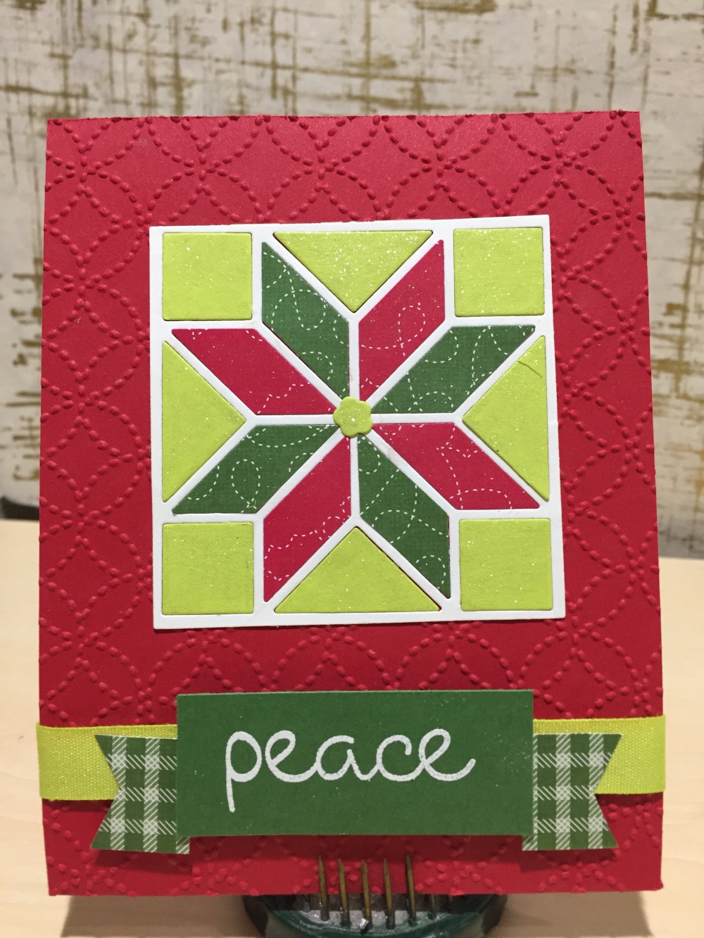 Wow!
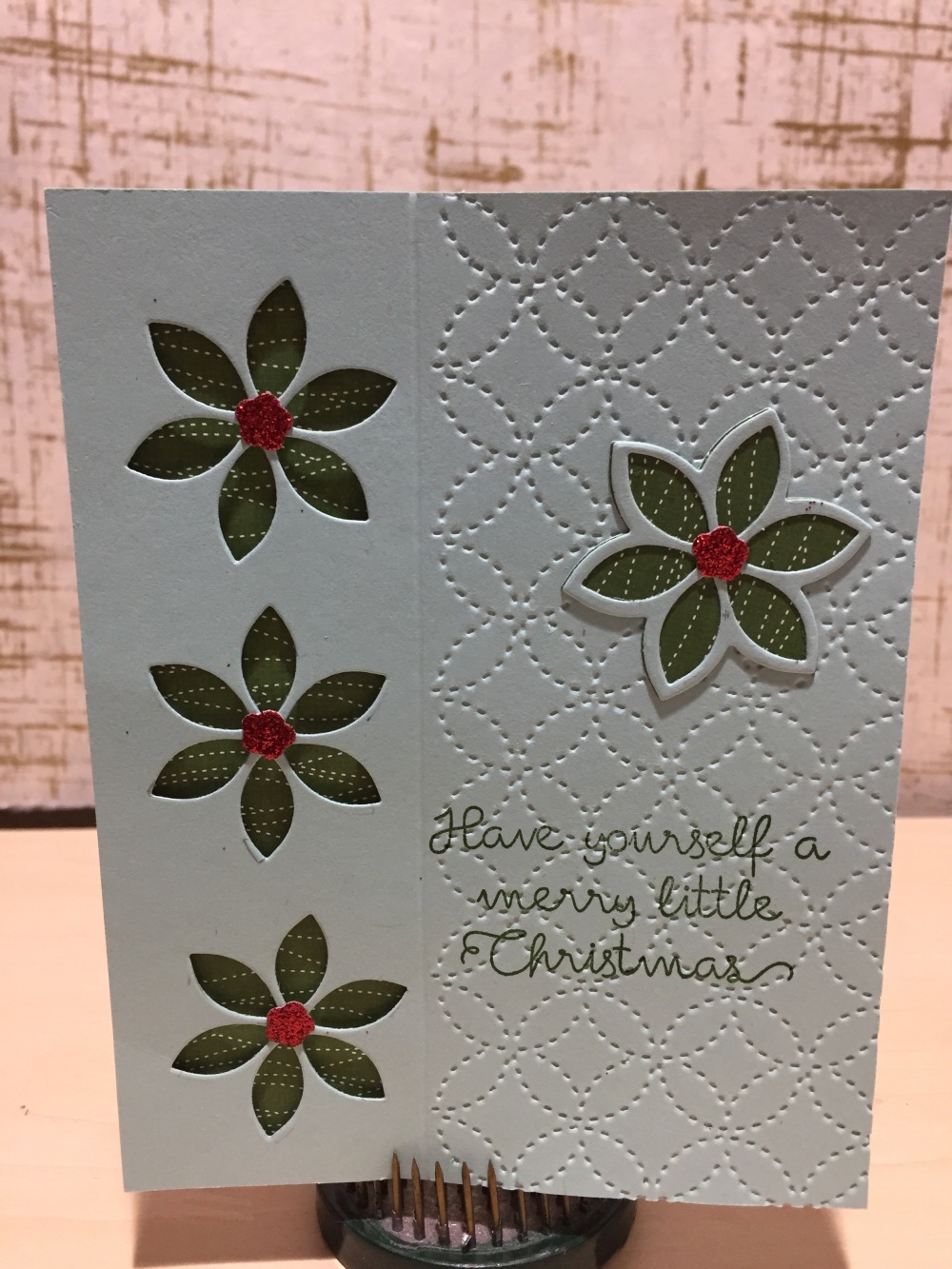
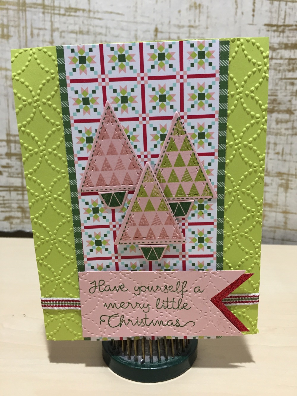
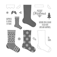
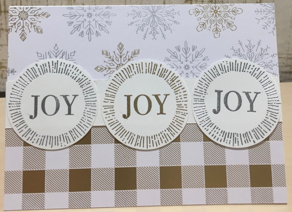
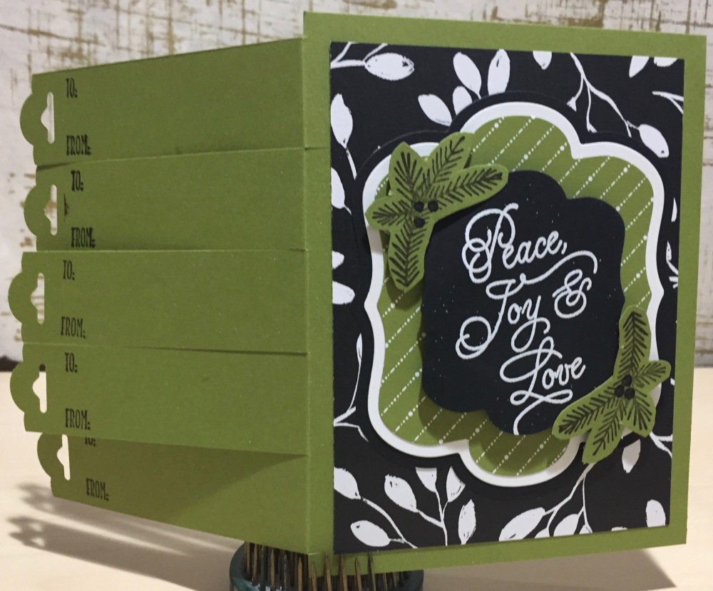
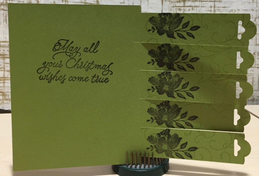
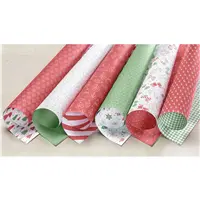
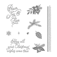
Wow!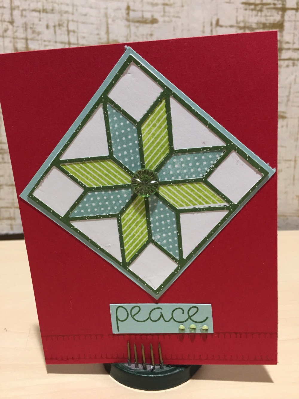 For this next card I used the stamps set. I stamped the stitched star outline on to Whisper White card and then used the striped and dotted quilt pieces to fill the star in. I cut the outline and the block out of one of the green DSP sheets and glued it over the top of the stamped panel. At the bottom of the card I used the tiny blanket stitch stamp that come with the set (be very careful- the blanket stitch and the cross stitch stamps are could easily go missing due to their size).